Cubic Design System
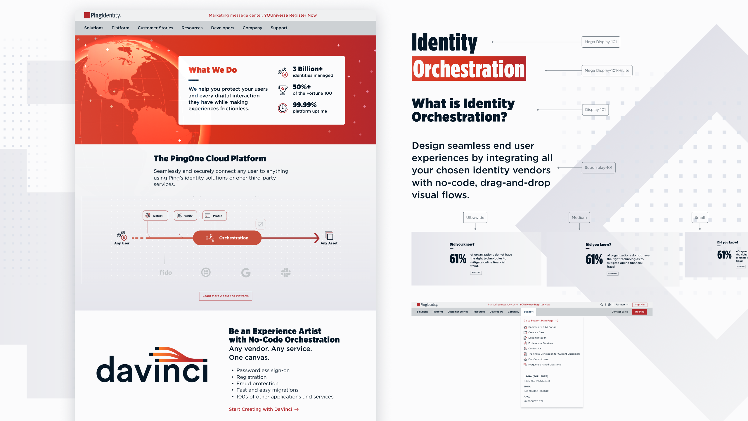
In 2021, Ping Identity’s corporate website was redesigned over the course of 8 months. Project Reimagine was a complete overhaul, and was built using a new design system, Cubic.
With Cubic, we took a data-driven approach to insure that we met the latest web accessibility standards. The new design required the design of over 700 graphic assets with 80 animations over 60 pages.
The visual system included new icon libraries, a patterning system, photographic treatments, diagram styles, and photo collages.
Project Details
2020–2022
Scope
Design System
Creative Direction
Website Design
Iconography
Photography
Creative Direction
Website Design
Iconography
Photography
Role
Creative Direction & Design Lead
Team
Mike Heighway, Creative Director
Régine Carreras, Senior Designer
Josh Kulchar, Senior Designer
Katie Daugherty, Designer
Ed Nepomuceno, UX Lead
Aaron Hughes, Dev Lead
Régine Carreras, Senior Designer
Josh Kulchar, Senior Designer
Katie Daugherty, Designer
Ed Nepomuceno, UX Lead
Aaron Hughes, Dev Lead
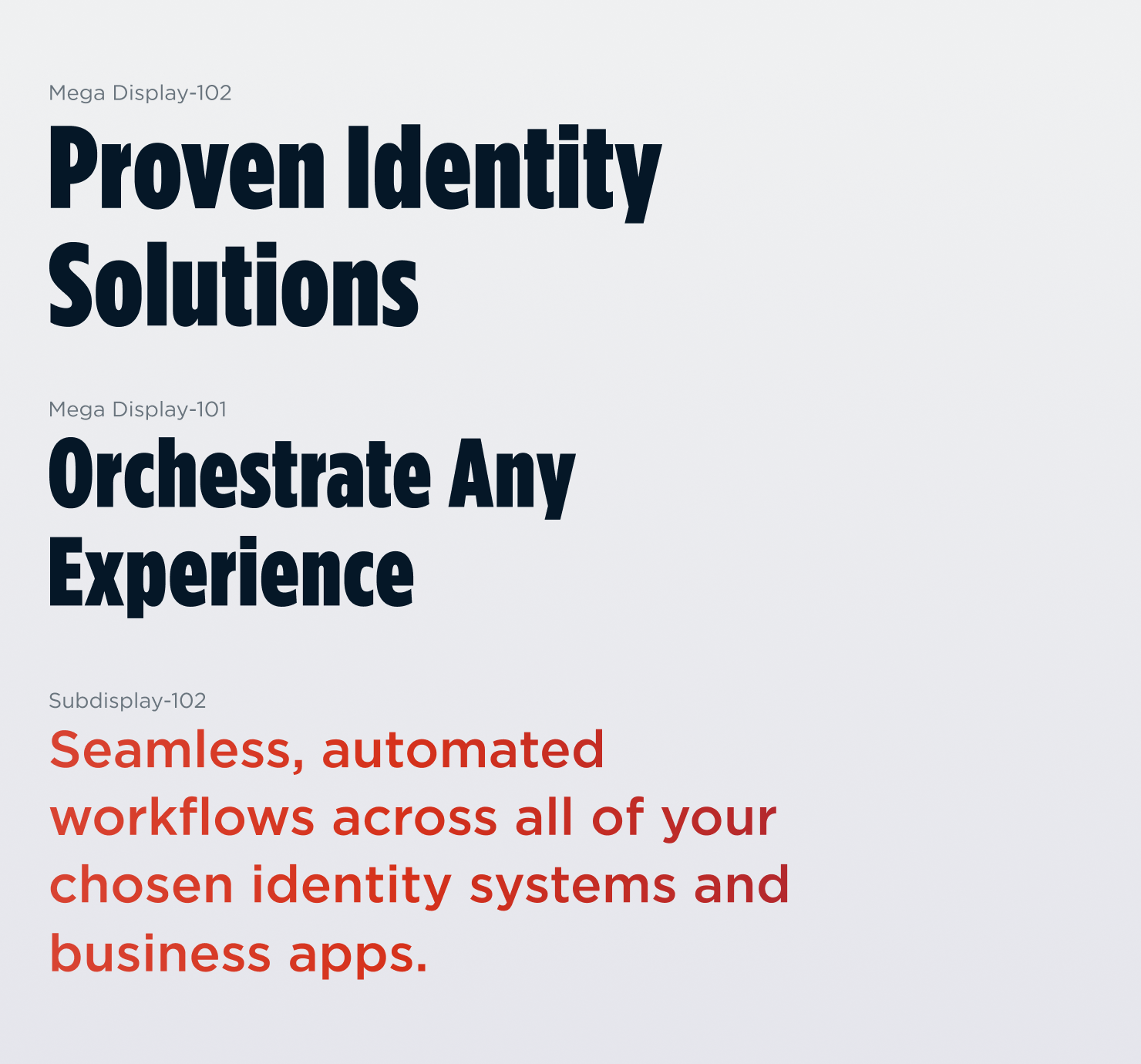
Typefaces
Gotham and Gotham Narrow by Tobias Frere Jones