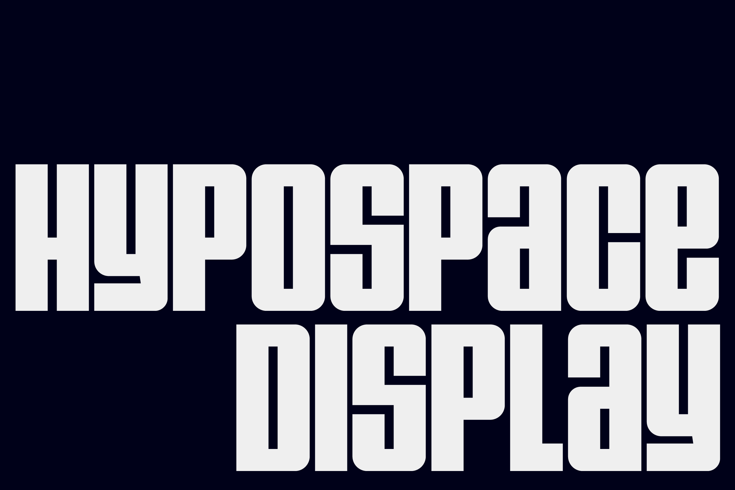
Hypospace Display
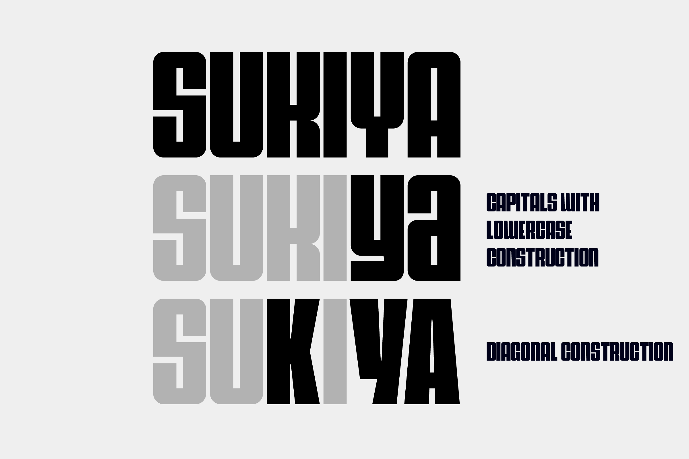
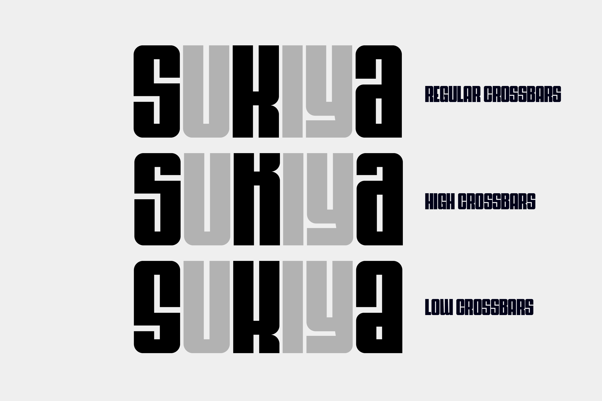
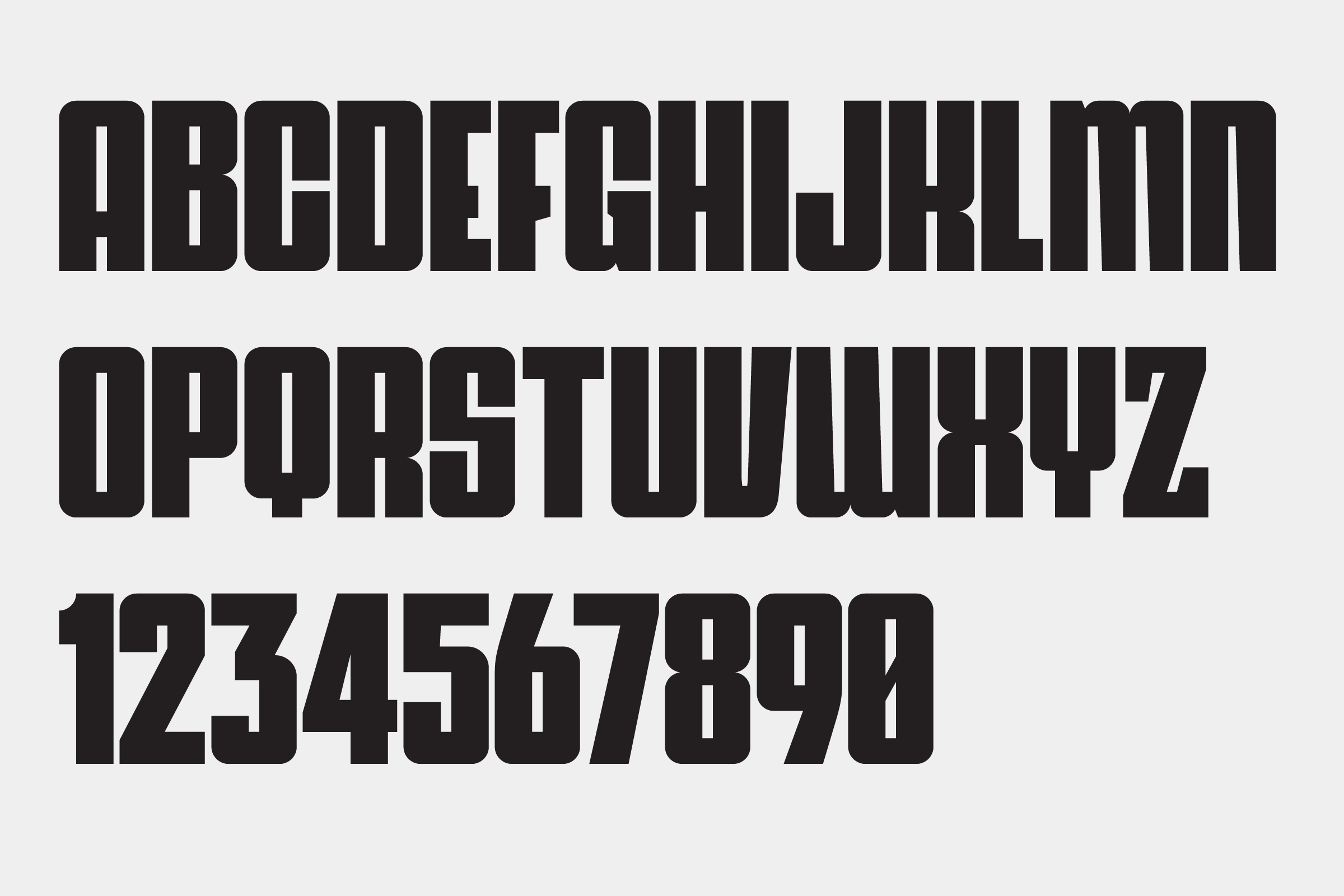
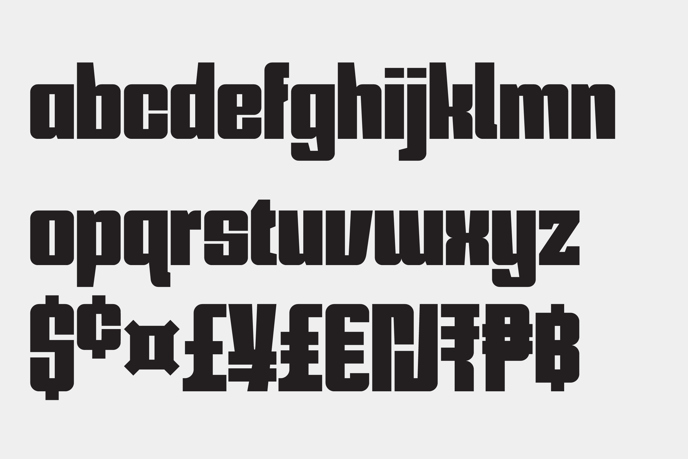
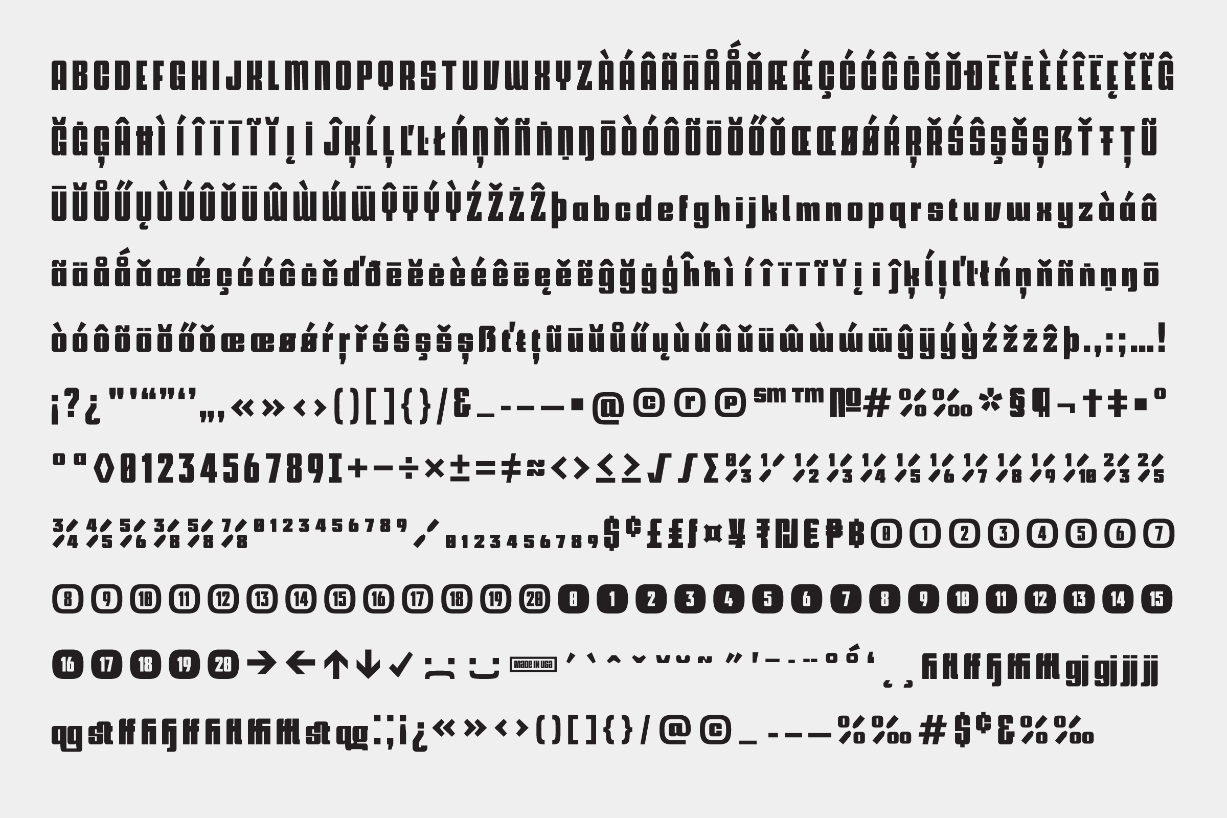
Hypospace Display captures attention with its modular grotesque style, making it an excellent choice for impactful titling. Supporting 256 Latin-script languages, this typeface offers broad linguistic versatility. Multiple stylistic sets ensure it can meet diverse design needs.
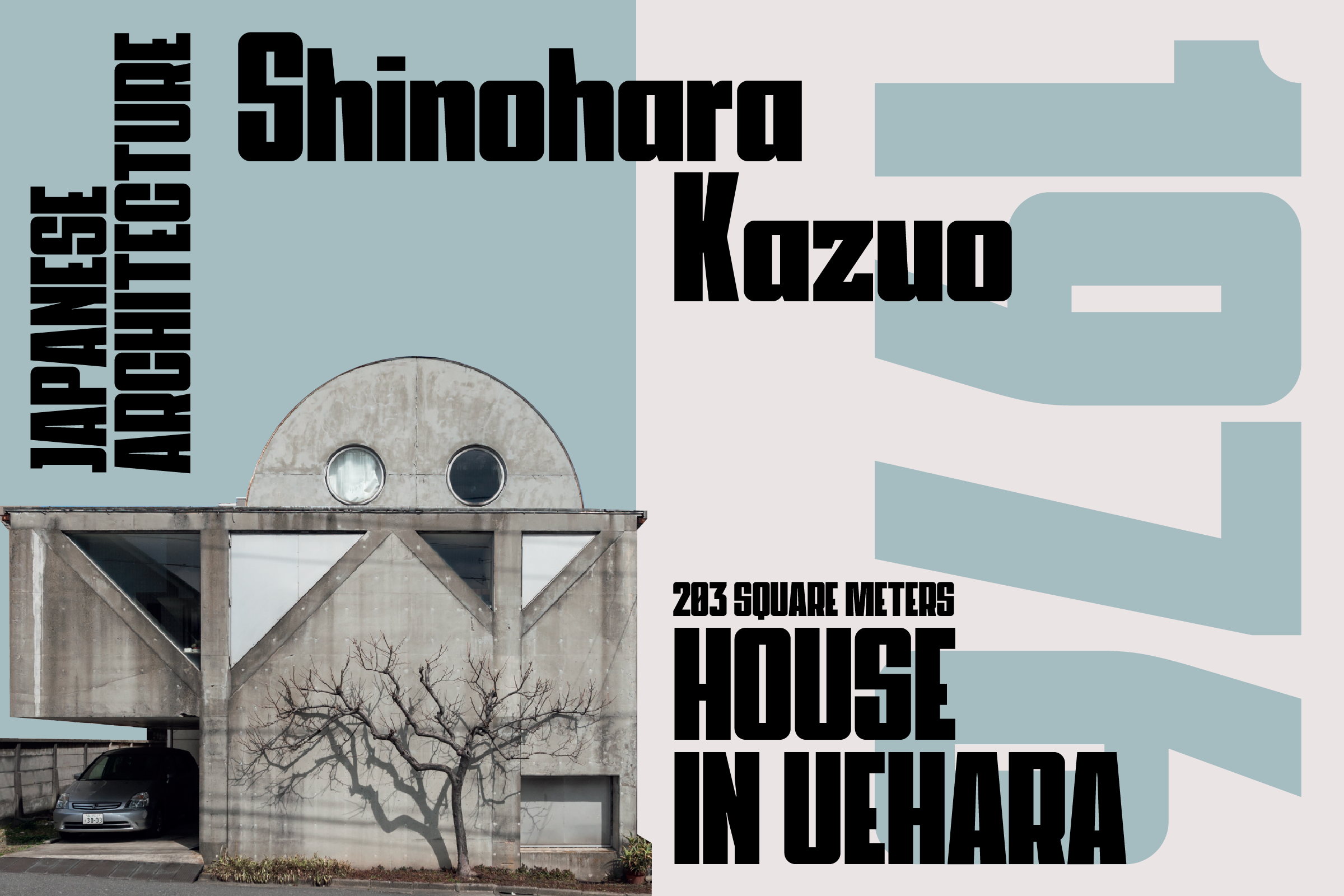
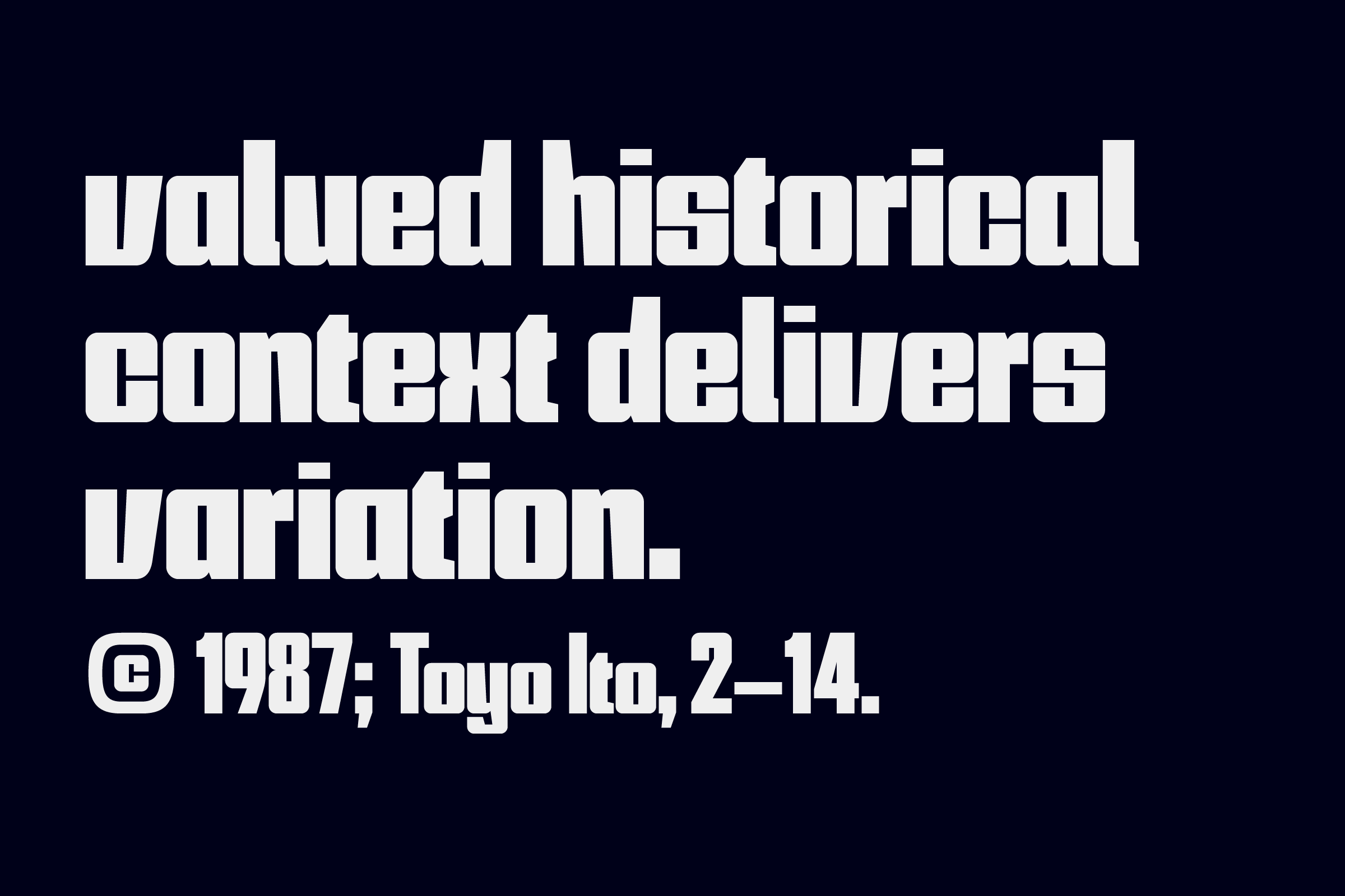
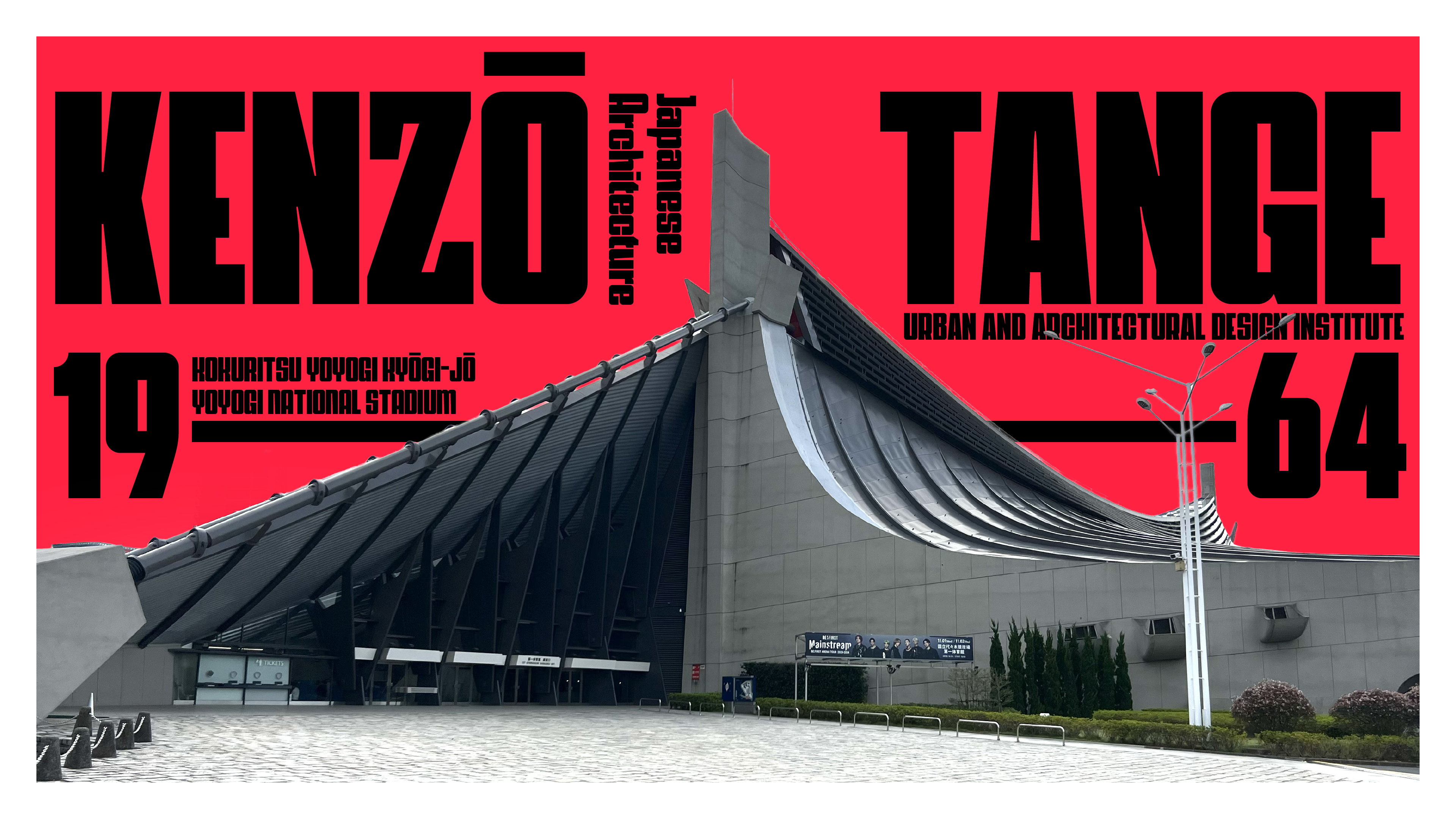
Taking cues from Japanese architecture's tatami—a spatial unit—the uppercase characters are crafted in a precise 1:2 ratio. This design choice, coupled with predominantly mono-width letterforms, results in a rhythmic typeface. Its small counters and tight kerning amplify cohesion across your typography projects.
Inspired by Wim Crouwel's Hiroshima poster, Hypospace Display is an evolution of a limited-character typeface originally crafted for "The Hypospace of Japanese Architecture." This two-volume book examines architecture in post-atomic Japan, and the typeface maintains its historical and aesthetic resonance.